
Food Healers

Problem
People in search of healthy, free food need a way to quickly and easily find the information regarding date, time, location, and what is being offered. Food Healers team members need a way to organize, streamline, and recruit more support.
Solution
A responsive web app that connects users to all Food Healers events, and allows Food Healers’ team members to recruit volunteers and request support for donations of food, supplies, and transportation. This app will include both ‘needs’ and ‘offers’, and will support people in need of healthy, free food as well as volunteers.

My role
I was the lead UX designer for Food Healers. My responsibility included organizing user research, end-to-end design, usability testing, as well as onboarding new team members and leading weekly standups. I was recruited into the project at the earliest stage and had the opportunity to strategize application goals, features, and the overall design process. Collaborators Jonny Jessup and Amber Spencer contributed to the project and participated in developing some of the UI and in testing. Additionally, in my role as designer, I remained conscious of the need to remain unbiased. Due especially to the fact that the app would be supporting users that experience food insecurity, it was vital that I continually engage in appropriate, yet respectful, research and testing.

Food Healers was designed and prototyped in Figma. I also utilized the Adobe Suite for some branding elements, and used Usablity Hub and Optimal Workshop for testing.

To further understand the app requirements, constraints, and opportunities, I engaged in extensive user research. I conducted competitive analysis with applications such as Share the Meal and Give Tide. The comps helped with app organization and UI, however there are not currently released apps that do exactly what Food Healers was hoping to do. I engaged in stakeholder interviews and attended weekly Food Healers volunteer meetings. To gain insight into users’ pain points, needs, and behaviors, I conducted surveys and interviews. I learned that users in search of food need to easily access public transportation and would like multiple ways to find free food information. The Food Healers volunteers’ biggest pain point was the lack of transportation for food and supplies. It was revealed to be the largest, logistical obstacle in their work. Research also helped me understand that users accustomed to donating did so primarily for altruistic reasons and when they believed in the mission. During interviews, they indicated they would like to be able to share their volunteerism via social media and would like a way to track their donation history.
User Personas
Three primary personas were created based on user research. One persona represented users in search of healthy, free food. Another persona represented a user that donates food, and the third persona represented a Food Healers driver. Interviews, including with people at free food events and with restaurant owners, helped craft the personas. Frustrations were particularly interesting. For example, many restaurant owners are distressed by the amount and by the cost of waste. However, they were incorrectly under the impression that there would be liability issues surrounding donating unused food. During research, I found that there are protections in place for food donations. All of these findings were useful throughout the design cycle.


User Flows
-
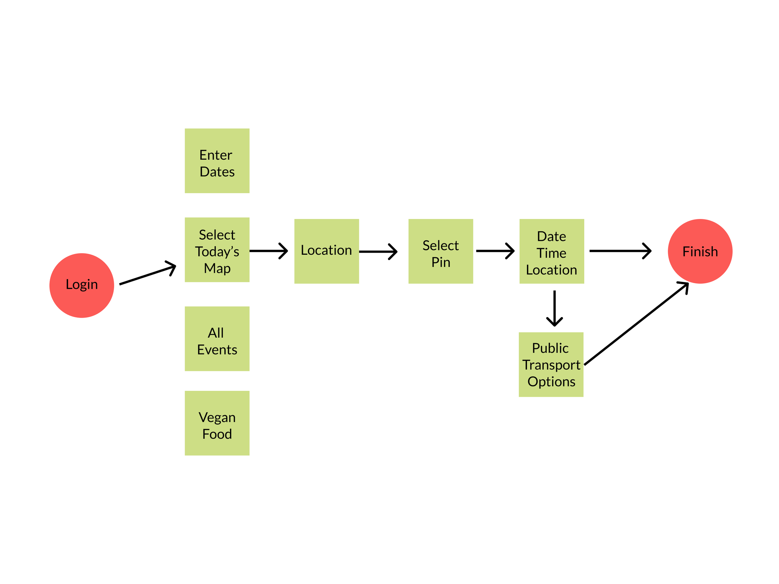
Users need a way to log in to the the app, select the map based on their location, find a Food Healers event, and access information regarding public transportation.
-

Users need a way to create a profile, indicate the food they wish to donate, provide specifics, and then set up notifications.
-

Food Healers drivers need a way to log in, accept a pickup, access the directions, indicated when they have picked up the donation, and then find the drop off point.
-

Users need a way to indicate what they wish to donate, communicate pickup time and other specifications, then track and share their donation receipts.

When designing the Food Healers’ features, we engaged in a few card sorts. This process helped us determine the information architecture. We learned the ways in which features should be grouped. We conducted a few rounds as we modified copy to make language and features clearer. At first, users were unclear how “Drive” and “Sign up to be a driver” connected to other aspects of the app.

Following the card sorts, we created a Food Healers site map. We kept the idea of ‘needs’ and ‘offers’ and developed a two-sided approach to the app. Users would be able to access both sides, however the intent was to make it easier to choose the specific flow- find food or volunteer.

Early designs were created with pen and paper. Paper wireframes helped me quickly generate ideas. The goal for Find Food was to allow users to complete the task in a few clicks as possible. I also knew that users would need various ways to access the information, for example, entering ‘cross streets’ or ‘current location’ rather than permanent address.
Mid-fidelity
The mid-fidelity screens allowed me to further develop features and flows. One challenge was to be inclusive of all requirements without over-complicating the design. The ‘needs’ side of the app was straight-forward, however the ‘offers’ side included numerous complex use cases. Notifications became an interesting and challenging problem to solve, for example, how to create notifications for when an item is picked up.
Identifying and clarifying goals
Best ways to support users that experience food insecurity
Little friction and few clicks, accessing information without a login requirement, allow app to locate rather than needing a permanent address, desktop version in addition to mobile, providing healthy food information in addition to healthy food for free.
Create a Team login
In order to be sure Food Healers team members can make specific requests for donations they need a log in, a version of an admin side of the app
Drivers
Generating a robust transportation system, to transport donated food and supplies, remains a big goal.
Requests from users
Users would like a feature to track their donation history as a way to ease the tax right off process.
Generating motivators
Two ways to help motivate more restaurant and small business owners to donate: one, create a feature in which users can share their donation and volunteering practices, thereby improving public perception; two, share information, including liability protection laws.


The ‘offers’ side Home Page was an exciting challenge. Copy became increasingly important. Do users “Donate”, “Offer”, or “Volunteer”? Donate is often associated with money (rather than food). We engaged in user testing to try out our assumptions.
Testing revealed user confusion with the top button. After several rounds, we discovered the most successful copy to be “Volunteer or Donate”. The second button performed best with “Volunteer to Drive”.
I decided to design a vertical and horizontal scroll for the ‘offers’ side Home Page. Users scroll down to see all categories and scroll horizontally to see each option. This design became the best choice to incorporate all requirements.

Early iterations of the Find Food and Volunteer flows. The goal for Find Food was to allow users to access food locations in as few of clicks as possible, reducing unnecessary friction. It was also important to make the flow easy to understand and follow. For Volunteer, we wanted users to explore many options, including signing up to drive. Transportation remained a big need for Food Healers, and we hoped to inspire users to participate.

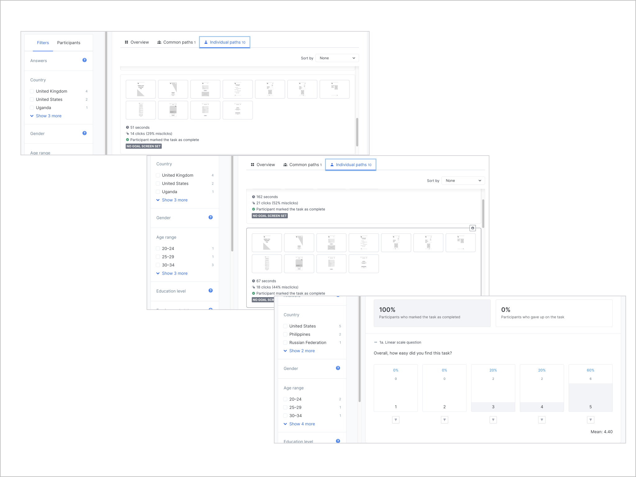
To test these early iterations, we engaged in task analysis. We used heat maps to determine where users clicked. We also tested time to completion, percentage of users that completed the task, and mis-clicks. Completion rates were 100% and overall difficulty was rated above 4, which is quite high.

Food Healers mission is to create a new food system, one that supports people and the planet. Healthy, plant-based food is central. In developing the mood board, I focused on vibrancy and aliveness. The color palette was selected to communicate health, as well as incorporate the saturated colors associated with good foods and a lush forest. In meetings with the founder, the vision “Healthy Food Should be Free” rang loud and clear. It became a focal point of the design.
When designing the high-fidelity screens, I first relied on a great deal of white space, leaning towards a minimal look. In later iterations I choose lush green as a background, in part in response to A/B testing results. I was still committed to contrast and to highlighting CTAs and other important features, which led me to created the white cards. Illustrations are reserved for the three onboarding screens, while photographs are used throughout the app. Again, horizontal and vertical scrolling is included.
High-Fidelity
-

A/B Testing
I tested screens with photographs versus screens with more white space and illustrations.
-

Results
Overwhelmingly, users preferred the screens with photographs 80% to 20%. They “loved the fresh vegetables” and the saturated colors. Users commented that it made them want to see more and engage with the app. They also felt it best communicated its purpose.


Clickable prototype

I designed the Food Healers app with a mobile-first approach, but later designed for different breakpoints, including tablet and desktop. Users will rely primarily on mobile. However, in early research I found users searching for food often use library computers for essential information. It was important to build out a complete desktop design.

I find it helpful to view the app in context. Seeing users with the app in hand is a great way to gain perspective.

MVP

Next steps
History Feature
Users indicated the desire to track their donation history. This feature is still in early design phase and needs much more development and testing.
Notifications
One of the most complex features/ requirements of Food Healers is the notification challenge. Users need real-time notifications for several use cases, including when an item has been picked up or dropped off, when new volunteers have signed up, or when new supplies have been requested. It will take considerable more iterating and developing to full flesh out this feature.
Scale
The Food Healers app is to support the ongoing Food Healers events. The goal is to develop it to scale and release it globally. This vision obviously creates a great deal of complexity. We incorporated a language selector, yet many other considerations will need to be made in order for the app to be so widely distributed.
What I learned
I had the opportunity to engage in numerous interviews over the course of the design process. Because of the app’s duality, with both ‘offers’ and ‘needs’, it required continuous testing for many types of users. For future designs of similar scale I would build out an even more robust research and testing plan.
Release date
The Food Healers app is currently in development, with plans to release October, 2022.